Vue Props
Vue has a configuration option called Props.
Props allow us to provide data to the component tags of the components using custom attributes.
Pass Data To a Component
Remember the previous page’s example when all three parts said “Apple”? We can now provide our components varied content and a unique design by passing data to them using props.
‘Apples’, ‘Pizza’, and ‘Rice’ will be displayed on a basic page.
To supply a prop with the <food-item/> component tags, we construct our own attribute ‘food-name’ in the main application file App.vue:
App.vue:
					<template>
  <h1>Food</h1>
  <food-item food-name="Apples"/>
  <food-item food-name="Pizza"/>
  <food-item food-name="Rice"/>
</template>

<script></script>

<style>
  #app > div {
    border: dashed black 1px;
    display: inline-block;
    width: 120px;
    margin: 10px;
    padding: 10px;
    background-color: lightgreen;
  }
</style>
Receive Data Inside a Component
We use this new ‘props’ configuration option to receive the data sent from App.vue via the ‘food-item’ attribute for data transmission. Now that we’ve listed the attributes we received, our component *.vue file is aware of them, and we can utilize the props anywhere we’d want, just like we would with a data property.
FoodItem.vue:
					<script>
  export default {
    props: [
      'foodName'
    ]
  }
</script>
In the <template> tag, props attributes are written with a dash to separate words (kebab-case), although this is not permitted in JavaScript. Rather, we must write the attribute names in JavaScript using camel Case, which Vue recognizes immediately!
Lastly, this is how our example with the <div> components for “Apples,” “Pizza,” and “Rice” appears:
Example
App.vue:
					<template>
  <h1>Food</h1>
  <food-item food-name="Apples"/>
  <food-item food-name="Pizza"/>
  <food-item food-name="Rice"/>
</template>
FoodItem.vue:
					<template>
  <div>
    <h2>{{ foodName }}</h2>
  </div>
</template>

<script>
  export default {
    props: [
      'foodName'
    ]
  }
</script>

<style></style>
We will soon examine how to give various data types to components as props properties, but first, let’s extend our code to include descriptions of each food type and place the <div> elements containing the food inside a Flexbox container.
Example
App.vue:
					<template>
  <h1>Food</h1>
  <div id="wrapper">
    <food-item
      food-name="Apples"
      food-desc="Apples are a type of fruit that grow on trees."/>
    <food-item
      food-name="Pizza"
      food-desc="Pizza has a bread base with tomato sauce, cheese, and toppings on top."/>
    <food-item
      food-name="Rice"
      food-desc="Rice is a type of grain that people like to eat."/>
  </div>
</template>

<script></script>

<style>
  #wrapper {
    display: flex;
    flex-wrap: wrap;
  }
  #wrapper > div {
    border: dashed black 1px;
    margin: 10px;
    padding: 10px;
    background-color: lightgreen;
  }
</style>
FoodItem.vue:
					<template>
  <div>
    <h2>{{ foodName }}</h2>
    <p>{{ foodDesc }}</p>
  </div>
</template>

<script>
  export default {
    props: [
      'foodName',
      'foodDesc'
    ]
  }
</script>

<style></style>
Boolean Props
Props of various data types allow us to accomplish varied functions, and when components are built from App.vue, we can set rules for how attributes are delivered.
Let’s include ‘isFavorite’ as a new prop. If the dish is deemed a favorite, we can utilize this boolean prop directly with v-show to display a favorite stamp <img> tag. It should have a value of either true or false.
It is necessary to put v-bind: in front of the attribute we wish to send in order to pass props with a data type other than String.
Here’s how to provide the App.vue boolean ‘isFavorite’ prop as a property called ‘is-favorite’:
App.vue:
					<template>
  <h1>Food</h1>
  <p>My favorite food has a diploma image attached to it.</p>
  <div id="wrapper">
    <food-item
      food-name="Apples"
      food-desc="Apples are a type of fruit that grow on trees."
      v-bind:is-favorite="true"/>
    <food-item
      food-name="Pizza"
      food-desc="Pizza has a bread base with tomato sauce, cheese, and toppings on top."
      v-bind:is-favorite="false"/>
    <food-item
      food-name="Rice"
      food-desc="Rice is a type of grain that people like to eat."
      v-bind:is-favorite="false"/>
  </div>
</template>
If the food is deemed to be the favorite, we display a favorite stamp using the boolean ‘isFavorite’ attribute that we receive inside FoodItem.vue:
Example
FoodItem.vue:
					<template>
  <div>
    <h2>
      {{ foodName }}
      <img decoding="async" src="data:image/svg+xml,%3Csvg%20xmlns='http://www.w3.org/2000/svg'%20viewBox='0%200%200%200'%3E%3C/svg%3E" v-show="isFavorite" alt="Vue Props -" title="Vue Props 1" data-lazy-src="/img_quality.svg"><noscript><img decoding="async" src="/img_quality.svg" v-show="isFavorite" alt="Vue Props -" title="Vue Props 1"></noscript>
    </h2>
    <p>{{ foodDesc }}</p>
  </div>
</template>

<script>
  export default {
      props: ['foodName','foodDesc','isFavorite']
  }
</script>

<style>
  img {
    height: 1.5em;
    float: right;
  }
</style>
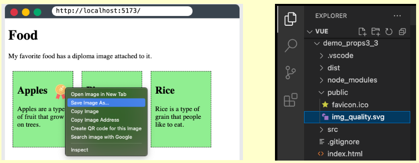
Images: Open the example above, right-click the image, select “Save Image As…”, and save it to the “public” folder in your project to make it work locally in the project on your computer.

Props Interface
We cannot be certain that we receive the ‘isFavorite’ attribute in the example above, nor can we be certain that its value is boolean based on the logic inside FoodItem.vue. We can create validation functions to verify the props we receive, specify the data-type of the props we receive, and declare props mandatory to aid us in this.
When we define props, it helps us work as a team by providing documentation for others and alerting us through the console when any of our established rules are violated.
Props as an Object
To have it as a reference, we comment out the part of FoodItem.vue where we defined the props in an array and define them as an object instead. In addition to the prop name, we may also specify each prop’s data type, like in this example:
FoodItem.vue:
					<script>
  export default {
    // props: ['foodName','foodDesc','isFavorite']
    props: {
      foodName: String,
      foodDesc: String,
      isFavorite: Boolean
    }
  }
</script>
Props defined in this manner make it easy for others to view what FoodItem.vue expects from the component.
A warning similar to this one appears in the console when a component that was generated from the parent element (App.vue in our example) is given a prop that is not the correct data type.

These alerts are helpful in informing us and others when a component is not being used correctly and in identifying the issue so that it may be fixed.
Required Props
We must specify the prop as an object in order to inform Vue that it is necessary. Let’s demand the prop ‘foodName’ in the following manner:
FoodItem.vue:
					<script>
  export default {
    // props: ['foodName','foodDesc','isFavorite']
    props: {
      foodName: {
        type: String,
        required: true
      },
      foodDesc: String,
      isFavorite: Boolean
    }
  }
</script>
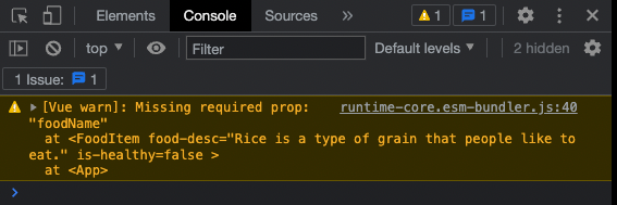
The console will display a warning similar to this one if a component is generated from the parent element (App.vue in our example) and a necessary prop is not defined:

These alerts are helpful in informing us and others when a component is not being used correctly and in identifying the issue so that it may be fixed.
Default Value
For a prop, we can set a default value.
In order to construct an item for rice without defining the ‘foodDesc’ parameter, let’s first set a default value for the ‘foodDesc’ prop in the ‘FoodItem’ component:
Example
App.vue:
					<template>
  <h1>Food</h1>
  <p>My favorite food has a diploma image attached to it.</p>
  <div id="wrapper">
    <food-item
      food-name="Apples"
      food-desc="Apples are a type of fruit that grow on trees."
      v-bind:is-favorite="true"/>
    <food-item
      food-name="Pizza"
      food-desc="Pizza has a bread base with tomato sauce, cheese, and toppings on top."
      v-bind:is-favorite="false"/>
    <food-item
      food-name="Rice"
      food-desc="Rice is a type of grain that people like to eat."
      v-bind:is-favorite="false"/>
  </div>
</template>
FoodItem.vue:
					<script>
  export default {
    props: {
      foodName: {
        type: String,
        required: true
      },
      foodDesc: {
        type: String,
        required: false,
        default: 'This is the default description.'
      }
      isFavorite: {
        type: Boolean,
        required: false,
        default: false
      }
    }
  }
</script>
Props Validator Function
A validator function that determines whether the prop value is valid or not can also be defined.
Validator functions of this kind have to return true or false. The prop value is considered invalid when the validator returns false. When we run our page in development mode, an invalid prop value triggers a warning in the browser console. This warning is a helpful reminder to make sure the components are used as intended.
Let’s imagine we have a specific character count in mind for the dish description—between 20 and 50. To ensure that the submitted meal description has a valid length, we can create a validator function.
FoodItem.vue:
					<script>
  export default {
    props: {
      foodName: {
        type: String,
        required: true
      },
      foodDesc: {
        type: String,
        required: false,
        default: 'This is the default description.',
        validator: function(value) {
          if( 20<value.length && value.length<50 ) {
            return true;
          }
          else {
            return false;
          }
        }
      }
      isFavorite: {
        type: Boolean,
        required: false,
        default: false
      }
    }
  }
</script>
Note: Because the pizza food description is 65 characters long—15 more than the validator function permits—you will receive a warning in development mode if you apply the validator code above to your local project.

Modify Props
We are not permitted to alter the value of the prop received in the child element once a component is established in the parent element. Therefore, we are unable to modify the value of the ‘isFavorite’ attribute that we obtain from App.vue within FoodItem.vue. In our situation, App.vue is the parent, and the prop is read-only from there.
However, imagine that we want the user to be able to click a button to alter which dish is deemed their favorite. The ‘isFavorite’ prop needs to be changed right now, but we are unable to do so because it is read-only.
‘isFavorite’ cannot be altered by us. An error will be produced as a result.
					methods: {
  toggleFavorite() {
    this.isFavorite = !this.isFavorite;
  }
}
In order to work around this, we can initialize a new data value inside FoodItem.vue called “foodIsFavorite” using the prop as follows:
					data() {
  return {
    foodIsFavorite: this.isFavorite
  }
}
We can now include the following function to allow the user to toggle this new data value:
					methods: {
  toggleFavorite() {
    this.foodIsFavorite = !this.foodIsFavorite;
  }
}
It is also necessary to modify v-show in the <img> tag to depend on the new data property ‘foodIsFavorite’ and add a toggle button to each food item. Additionally, we reduce the props declaration to just an array in order to simplify our example.
Example
FoodItem.vue:
					<template>
  <div>
    <h2>
      {{ foodName }}
      <img decoding="async" src="data:image/svg+xml,%3Csvg%20xmlns='http://www.w3.org/2000/svg'%20viewBox='0%200%200%200'%3E%3C/svg%3E" v-show="foodIsFavorite" alt="Vue Props -" title="Vue Props 6" data-lazy-src="/img_quality.svg"><noscript><img decoding="async" src="/img_quality.svg" v-show="foodIsFavorite" alt="Vue Props -" title="Vue Props 6"></noscript>
    </h2>
    <p>{{ foodDesc }}</p>
    <button v-on:click="toggleFavorite">Favorite</button>
  </div>
</template>

<script>
  export default {
  props: ['foodName','foodDesc','isFavorite'],
  data() {
    return {
      foodIsFavorite: this.isFavorite
    }
  },
  methods: {
    toggleFavorite() {
      this.foodIsFavorite = !this.foodIsFavorite;
    }
  }
}
</script>

<style>
  img {
    height: 1.5em;
    float: right;
  }
</style>
