Navigation Item
We have covered both the Navigation Controller and the Navigation Bar in this article. These two components work together to provide view controller navigation within an iOS application. But if we ignore the navigation item, the conversation would never end. We will go over each navigation item utilized in the navigation bar in depth in this section of the course.
In iOS applications, a Navigation object is an object that a navigation bar displays, allowing the user to interact and navigate to other view controllers. It is an instance of the NSObject-derived UINavigationItem class.
class UINavigationItem : NSObject
A view controller receives a UINavigationItem object containing the buttons and views that will be shown in its navigation bar when it is pushed into the navigation stack. Although each view controller in the navigation stack has a similar navigation bar, each view controller’s associated navigation item object is unique and unique.
The title of the view controller at the top of the navigation stack is always displayed along with other details about the view controller that is linked with a navigation item object. One or more right buttons on the navigation bar of the view controller may be present to allow the user to initiate certain operations. The leftBarButtonItems and rightBarButtonItems properties, which are used to define the left and right bar button items, are contained in the UINavigationItem. The amount of room in the navigation bar that these items have always determines how they appear.
The back button’s appearance, which is used to move to the previous view controller, can be customized using the backBarButtonItem property of a navigation item. But when the View Controller is the Root View Controller, the back bar button is hidden.
To generate the bar button items that are designated as left or right bar button items for the navigation item, the UIBarButtonItem class is instantiated.
UINavigationItem Properties
The properties of the UINavigationItem class are listed in the following table.
| SN | Property | Description |
|---|---|---|
| 1 | var title: String? | It represents the title of the associated view controller. |
| 2 | var largeTitleDisplayMode: UINavigationItem.LargeTitleDisplayMode | It represents the mode in which the title is to be displayed on the navigation bar. |
| 3 | var prompt: String? | It represents the single line of the text displayed at the top of the navigation bar. |
| 4 | var backBarButtonItem: UIBarButtonItem? | It represents the back-button item associated with the navigation controller. |
| 5 | var hidesBackButton: Bool | It is a boolean value indicating whether the back button is hidden or not. |
| 6 | var leftBarButtonItems: [UIBarButtonItem]? | It is an array of UIBarButtonItem that is displayed on the left of the navigation bar. |
| 7 | var leftItemsSupplementBackButton: Bool | It is a Boolean value indicating whether the left items are displayed in addition to the back button in the navigation bar. |
| 8 | var leftBarButtonItem: UIBarButtonItem? | It is the UIBarButtonItem object that is displayed on the left of the navigation bar. |
| 9 | var rightBarButtonItems: [UIBarButtonItem]? | It is the array of the UIBarButtonItem Object that is displayed on the right of the navigation bar. |
| 10 | var rightBarButtonItem: UIBarButtonItem? | It is the UIBarButtonItem object that is displayed on the right of the navigation bar. |
| 11 | var standardAppearance: UINavigationBarAppearance? | It represents the appearance settings for a standard-height navigation bar. |
| 12 | var compactAppearance: UINavigationBarAppearance? | The appearance settings for a compact-height navigation bar. |
| 13 | var scrollEdgeAppearance: UINavigationBarAppearance? | It represents the appearance settings to use when the edge of any scrollable content reaches the matching edge of the navigation bar. |
| 14 | var searchController: UISearchController? | It represents the search controller that is integrated into the navigation bar. |
| 15 | var hidesSearchBarWhenScrolling: Bool | It is a Boolean type value indicating whether the integrated search bar will be hidden on scrolling. |
UINavigationItem Methods
The following methods for configuring the appearance are available in the UINavigationItem class.
| SN | Methods | Description |
|---|---|---|
| 1 | func setHidesBackButton(Bool, animated: Bool) | It accepts a boolean value indicating whether the back button will be hidden, and the function hides the back button accordingly. |
| 2 | func setLeftBarButtonItems([UIBarButtonItem]?, animated: Bool) | It displays the left bar button items to the specified array of UIBarButtonItem objects. It also optionally animates the process. |
| 3 | func setLeftBarButton(UIBarButtonItem?, animated: Bool) | It displays the left bar button item to the specified UIBarButtonItem object. It also optionally animates the process. |
| 4 | func setRightBarButtonItems([UIBarButtonItem]?, animated: Bool) | It displays the right bar button items to the specified array of UIBarButtonItem objects. It also optionally animates the process. |
| 5 | func setRightBarButton(UIBarButtonItem?, animated: Bool) | It displays the right bar button item to the specified UIBarButtonItem object. It also optionally animates the process. |
Configuring NavigationBar Appearance
The bar style is set using the UINavigationBar’s barStyle property. The navigation bar often comes in two visual styles: default and black. The navigation bar’s black backdrop and white lettering are a result of the black style. To make it semitransparent, we may also set it to translucent. The attributes of the interface builder that are used to configure the navigation bar are shown in the following table.
Interface Builder Attributes Core Attributes
| SN | Attribute | Description |
|---|---|---|
| 1 | Style | It represents the bar style of the navigation bar. It controls the bar tint color and the title color. This value can access at runtime using barStyle and isTransluecent properties. |
| 2 | Bar Tint | It controls the tint color of the navigation bar. This value can be accessed at runtime using barTintColor property. |
| 3 | Shadow Image | It controls the shadow image that is displayed beneath the navigation bar. This value can be accessed at runtime using shadowImage property. |
| 4 | Back Image | It controls the image that is used to appear at the edge of the back button. This value can be accessed at runtime using the backIndicatorImage property. |
| 5 | Back Mask | It specified the mask associated with the back-image attribute. This must be used in the association with the back-image attribute since it controls the appearance of the back button during the animated transitions. This value can be accessed using backIndicatorTransitionMaskImage property. |
Example
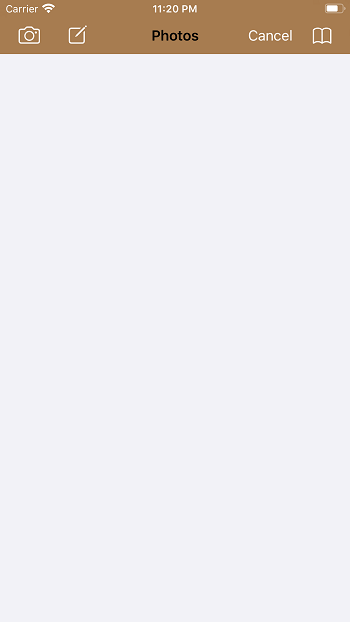
The custom left and right bar button items for a navigation item object will be defined in this example.
NavItemController.swift
					import UIKit
class NavItemController : UIViewController {
    override func viewDidLoad() {
        super.viewDidLoad()
        let rightItem1 = UIBarButtonItem(barButtonSystemItem: .bookmarks, target: self, action: nil)
        let rightItem2 = UIBarButtonItem(barButtonSystemItem: .cancel, target: self, action: #selector(clickedCancel))
        let leftItem1 = UIBarButtonItem(barButtonSystemItem: .camera, target: self, action: nil)
        let leftItem2 = UIBarButtonItem(barButtonSystemItem: .compose, target: self, action: nil)

        rightItem2.tintColor = UIColor.white
        rightItem1.tintColor = UIColor.white

        leftItem1.tintColor = UIColor.white
        leftItem2.tintColor = UIColor.white

        navigationItem.title = "Photos"

        navigationItem.leftBarButtonItems = [leftItem1, leftItem2]
        navigationItem.rightBarButtonItems = [rightItem1, rightItem2]
    }

    @objc func clickedCancel(){
        self.navigationController?.popViewController(animated: true)
    }
}
Output

