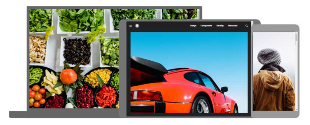
The Picture Element

Bookmarks made with HTML links allow users to navigate to particular sections of a website.

The HTML < picture > Element
Web developers now have greater flexibility in defining image resources thanks to the HTML <picture> element.
One or more <source> elements, each referring to a separate image through the srcset attribute, are contained within the <picture> element. In this manner, the browser can select the image that best matches the device or current view.
A media attribute on every <source> element indicates when an image is most appropriate.
Example
Show different images for different screen sizes:
					<picture>
  <source media="(min-width: 640px)" data-lazy-srcset="img_beach.jpg">
  <source media="(min-width: 455px)" data-lazy-srcset="img_bike.jpg">
  <img decoding="async" src="data:image/svg+xml,%3Csvg%20xmlns='http://www.w3.org/2000/svg'%20viewBox='0%200%200%200'%3E%3C/svg%3E" alt="The Picture Element - Picture Element" title="The Picture Element 3" data-lazy-src="img_boy.jpg"><noscript><img decoding="async" src="img_boy.jpg" alt="The Picture Element - Picture Element" title="The Picture Element 3"></noscript>
</picture>
When to use the Picture Element
The <picture> element serves these two primary functions:
1. Bandwidth
Loading a huge image file is not necessary if your device or screen is small. Any subsequent <source> elements will be ignored by the browser, which will only use the first one with matching attribute values.
2. Format Support
Not all picture formats may be supported by all browsers or devices. You can add photos in any format by using the <picture> element; the browser will utilize the first format it detects and disregard any other elements.
Example
The browser will use the first image format it recognizes:
					<picture>
  <source data-lazy-srcset="img_car.png">
  <source data-lazy-srcset="img_boy.jpg">
  <img decoding="async" src="data:image/svg+xml,%3Csvg%20xmlns='http://www.w3.org/2000/svg'%20viewBox='0%200%200%200'%3E%3C/svg%3E" alt="Beatles" style="width:auto;" title="The Picture Element 4" data-lazy-src="img_beatles.gif"><noscript><img decoding="async" src="img_beatles.gif" alt="Beatles" style="width:auto;" title="The Picture Element 4"></noscript>
</picture>
HTML Image Tags
picture element
HTML
image
responsive design
bandwidth
format support
source element
srcset
media attribute
image formats
img tag
map tag
area tag
HTML
HTML5
HTML tutorials
Learn HTML
Free HTML tutorials
HTML Example
HTML Explained
The HTML element is a powerful tool for delivering responsive images in web development. Unlike the traditional tag, the element allows developers to specify multiple image sources, enabling the browser to select the most appropriate image based on factors such as screen size, device capabilities, and network conditions.
At the core of the element is the element, which provides alternative image sources for the browser to choose from. The element can specify different image formats, resolutions, or even different images altogether, giving the browser the flexibility to serve the most optimal image for the user’s context.
Theelement’s `srcset` attribute allows developers to provide a list of image sources and their corresponding resolutions or pixel densities. This enables the browser to select the most appropriate image based on the user’s device and screen size, ensuring that the image is not too large and consuming unnecessary bandwidth.
The `media` attribute of theelement is another powerful feature, allowing developers to specify the conditions under which a particular image source should be used. This can be based on factors such as screen size, device orientation, or even network conditions, ensuring that users with slower connections or smaller screens receive appropriately sized images.
By using the element in conjunction with the and tags, web developers can create responsive and optimized image experiences that cater to a wide range of user scenarios, from high-resolution displays to low-bandwidth connections.
The HTML element is a powerful tool for optimizing image delivery on the web. Unlike the traditional tag, the element allows you to provide multiple image sources, enabling the browser to choose the most appropriate one based on various factors such as screen size, device capabilities, and network conditions.
At the core of the element is the element, which allows you to specify different image sources and their corresponding attributes. This includes the image format, screen size, and other media-specific characteristics. The browser then selects the most suitable image source to display, ensuring optimal performance and responsiveness.
One of the key benefits of the element is its ability to serve different image formats to different browsers. For example, you can provide a WebP image for browsers that support it, while falling back to a JPEG or PNG format for older browsers that don’t. This helps to reduce bandwidth usage and improve page load times, especially on mobile devices.
The element also works seamlessly with the `srcset` and `sizes` attributes, which allow you to provide multiple image sources with different resolutions. This enables the browser to choose the most appropriate image size based on the user’s device and screen dimensions, further enhancing the responsive design of your web pages.
By leveraging the power of the element, web developers can create more efficient and visually appealing websites that deliver the best possible user experience across a wide range of devices and network conditions.
