Stacked Line Charts
Stacked Line
Data trends are represented by stacked line charts.
Lines are stacked on top of one another to accomplish this.
When working with data that can be arranged in a hierarchy, stacked line charts are utilized.
When you have multiple data columns that add up to the overall trend, you use the charts.
Note: Ordinal data are those that may be arranged in a hierarchy, such as numerical values or letter grades ranging from A to F. Ordinal data is covered in more detail at Statistics – Measurement Levels.
Example
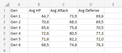
Let’s examine the cumulative average stats for all Pokemon generations.
To keep up, copy the values:
Note: There is one decimal place in this data.

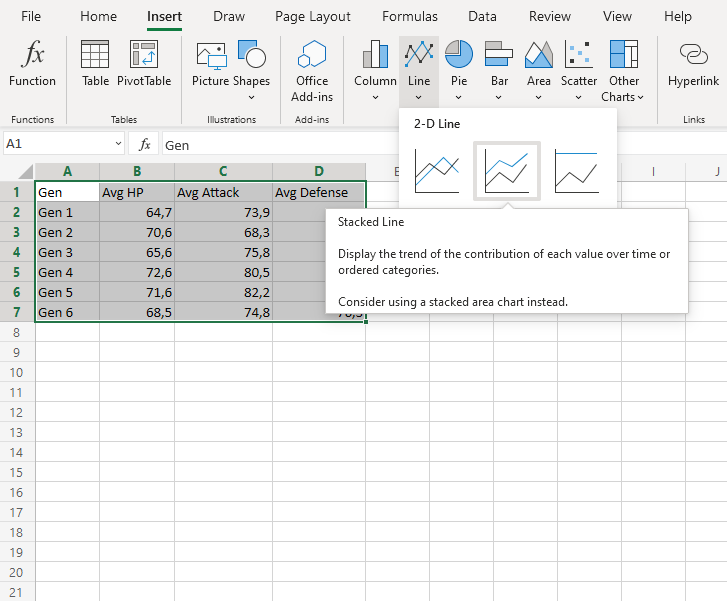
- Choose the labels and data range A1:D7.
Note: To access this menu, expand the ribbon.
2. Select Stacked Line () from the drop-down menu after selecting the Insert menu and the Line menu (
).

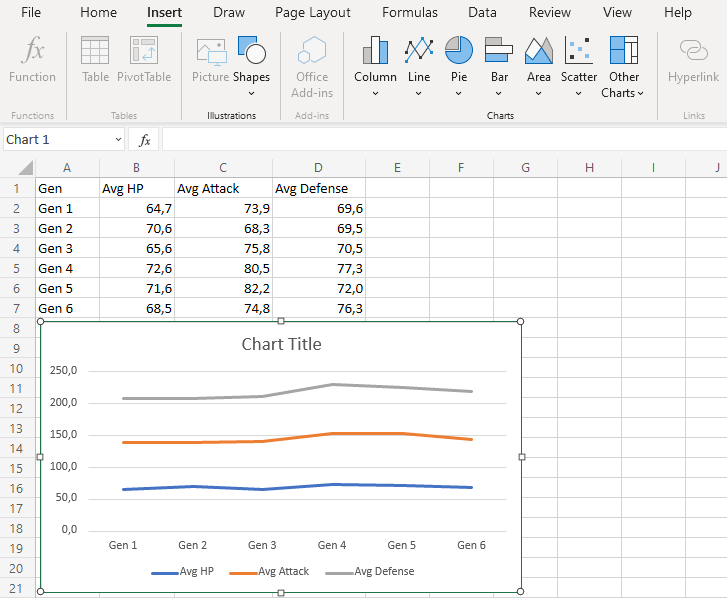
You should get the chart below:

The graph provides a visual summary of the typical Pokemon stats between generations.
The average HP is displayed by the blue line, while the average attack and HP are added by the orange line. When all average stats are tallied up, the gray line represents the total of all the stats.
Pokemon from the fourth generation, on average, have the highest stats, according to this chart.
Stacked Line with Markers
Data points on a stacked line chart are highlighted with markers on the stacked line with markers.
Example
Let’s examine the cumulative average stats for all Pokemon generations.
To keep up, copy the values:
Note: There is one decimal place in this data.

- Choose the labels and data range A1:D7.
Note: To access this menu, expand the ribbon.
2. Select Stacked Line with Markers () from the drop-down menu after selecting the Insert menu and the Line menu (
).

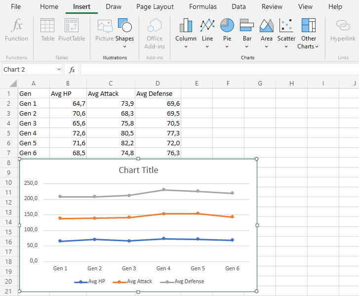
You should get the chart below:

The graph provides a visual summary of the typical Pokemon stats between generations.
The average HP is displayed by the blue line, while the average attack and HP are added by the orange line. When all average stats are tallied up, the gray line represents the total of all the stats.
Pokemon from the fourth generation, on average, have the highest stats, according to this chart.
