Grid Intro

Grid Layout
Designing web pages is made easier by the CSS Grid Layout Module, which provides a grid-based layout system with rows and columns in place of floats and positioning.
Browser Support
The grid properties are supported in all modern browsers.

Grid Elements
A parent element and one or more child elements make up a grid layout.
Example
					<div class="grid-container">
  <div class="grid-item">1</div>
  <div class="grid-item">2</div>
  <div class="grid-item">3</div>
  <div class="grid-item">4</div>
  <div class="grid-item">5</div>
  <div class="grid-item">6</div>
  <div class="grid-item">7</div>
  <div class="grid-item">8</div>
  <div class="grid-item">9</div>
</div>

Display Property
When the display property of an HTML element is set to grid or inline-grid, the element becomes a grid container.
Example
					.grid-container {
  display: grid;
}
Example
					.grid-container {
  display: inline-grid;
}
The grid container’s direct offspring all automatically become grid items.
Grid Columns
Columns are the vertical lines that make up a grid item.

Grid Rows
Rows are the horizontal lines that make up a grid item.

Grid Gaps
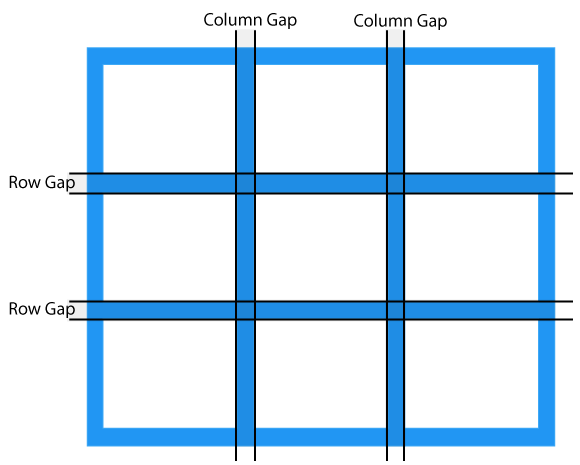
Gaps are the spaces that exist between each column and row.

You can adjust the gap size by using one of the following properties:
- column-gap
- row-gap
- gap
Example
The column-gap property sets the gap between the columns:
					.grid-container {
  display: grid;
  column-gap: 50px;
}
Example
The row-gap property sets the gap between the rows:
					.grid-container {
  display: grid;
  row-gap: 50px;
}
Example
The gap property is a shorthand property for the row-gap and the column-gap properties:
					.grid-container {
  display: grid;
  gap: 50px 100px;
}
Example
The gap property can also be used to set both the row gap and the column gap in one value:
					.grid-container {
  display: grid;
  gap: 50px;
}
Grid Lines
Column lines are the lines that go between columns.
Row lines are the lines that separate rows.

When inserting a grid item into a grid container, make use of the line numbers:
Example
Place a grid item at column line 1, and let it end on column line 3:
					.item1 {
  grid-column-start: 1;
  grid-column-end: 3;
}
Example
Place a grid item at row line 1, and let it end on row line 3:
					.item1 {
  grid-row-start: 1;
  grid-row-end: 3;
}
All CSS Grid Properties
| Property | Description |
|---|---|
| column-gap | Specifies the gap between the columns |
| gap | A shorthand property for the row-gap and the column-gap properties |
| grid | A shorthand property for the grid-template-rows, grid-template-columns, grid-template-areas, grid-auto-rows, grid-auto-columns, and the grid-auto-flow properties |
| grid-area | Either specifies a name for the grid item, or this property is a shorthand property for the grid-row-start, grid-column-start, grid-row-end, and grid-column-end properties |
| grid-auto-columns | Specifies a default column size |
| grid-auto-flow | Specifies how auto-placed items are inserted in the grid |
| grid-auto-rows | Specifies a default row size |
| grid-column | A shorthand property for the grid-column-start and the grid-column-end properties |
| grid-column-end | Specifies where to end the grid item |
| grid-column-gap | Specifies the size of the gap between columns |
| grid-column-start | Specifies where to start the grid item |
| grid-gap | A shorthand property for the grid-row-gap and grid-column-gap properties |
| grid-row | A shorthand property for the grid-row-start and the grid-row-end properties |
| grid-row-end | Specifies where to end the grid item |
| grid-row-gap | Specifies the size of the gap between rows |
| grid-row-start | Specifies where to start the grid item |
| grid-template | A shorthand property for the grid-template-rows, grid-template-columns and grid-areas properties |
| grid-template-areas | Specifies how to display columns and rows, using named grid items |
| grid-template-columns | Specifies the size of the columns, and how many columns in a grid layout |
| grid-template-rows | Specifies the size of the rows in a grid layout |
| row-gap | Specifies the gap between the grid rows |
