CSS Rounded Corners

CSS border-radius Property
The corners of an element’s radius are specified by the CSS border-radius property.
Advice: You can provide items rounded corners by using this property!
Here are three instances:
- For an element with a designated background color, rounded corners:
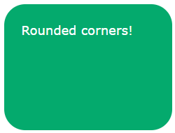
2. If an element has a border, rounded corners:

3. If an element has a background picture, its corners should be rounded:

code:
					#rcorners1 {
  border-radius: 25px;
  background: #73AD21;
  padding: 20px;
  width: 200px;
  height: 150px;
}

#rcorners2 {
  border-radius: 25px;
  border: 2px solid #73AD21;
  padding: 20px;
  width: 200px;
  height: 150px;
}

#rcorners3 {
  border-radius: 25px;
  background: url(paper.gif);
  background-position: left top;
  background-repeat: repeat;
  padding: 20px;
  width: 200px;
  height: 150px;
}
A helpful hint is that the border-radius property is essentially a shortcut for the border-top-left, border-top-right, border-bottom-left, and border-bottom-right properties.
CSS border-radius - Specify Each Corner
There are one to four possible values for the border-radius attribute. The guidelines are as follows:
Four values (the first applies to the top-left corner, the second to the top-right corner, the third to the bottom-right corner, and the fourth to the bottom-left corner) for the border-radius are 15px 50px 30px 5px;

Border-radius: 15px 50px 30px; (top-left corner applies to first value, top-right and bottom-left corner applies to second value, and bottom-right corner applies to third value):

Border-radius: 15px 50px; (the top-left and bottom-right corners are affected by the first value, while the top-right and bottom-left corners are affected by the second value):

There is only one value, border-radius: 15px; (the value rounds all four corners equally.)

Here is the code:
					#rcorners1 {
  border-radius: 15px 50px 30px 5px;
  background: #73AD21;
  padding: 20px;
  width: 200px;
  height: 150px;
}

#rcorners2 {
  border-radius: 15px 50px 30px;
  background: #73AD21;
  padding: 20px;
  width: 200px;
  height: 150px;
}

#rcorners3 {
  border-radius: 15px 50px;
  background: #73AD21;
  padding: 20px;
  width: 200px;
  height: 150px;
}

#rcorners4 {
  border-radius: 15px;
  background: #73AD21;
  padding: 20px;
  width: 200px;
  height: 150px;
}
You could also create elliptical corners:
					#rcorners1 {
  border-radius: 50px / 15px;
  background: #73AD21;
  padding: 20px;
  width: 200px;
  height: 150px;
}

#rcorners2 {
  border-radius: 15px / 50px;
  background: #73AD21;
  padding: 20px;
  width: 200px;
  height: 150px;
}

#rcorners3 {
  border-radius: 50%;
  background: #73AD21;
  padding: 20px;
  width: 200px;
  height: 150px;
}
CSS Rounded Corners Properties
| Property | Description |
|---|---|
| border-radius | A shorthand property for setting all the four border-*-*-radius properties |
| border-top-left-radius | Defines the shape of the border of the top-left corner |
| border-top-right-radius | Defines the shape of the border of the top-right corner |
| border-bottom-right-radius | Defines the shape of the border of the bottom-right corner |
| border-bottom-left-radius | Defines the shape of the border of the bottom-left corner |
