CSS Object-fit
An <img> or <video> can be scaled to fit its container by using the CSS object-fit property.
The CSS object-fit Property
An <img> or <video> can be scaled to fit its container by using the CSS object-fit property.
This attribute instructs the content to fill the container in a number of ways, including “stretch up and take up as much space as possible” and “preserve that aspect ratio”.
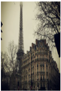
Take a look at this photo taken in Paris. The size of this image is 300 pixels high by 400 pixels wide.

On the other hand, the image above will seem as follows if we style it to be half its width (200 pixels) and the same height (300 pixels):
Example
					img {
  width: 200px;
  height: 300px;
}
It is evident that the image is being compressed to fit within the 200×300 pixel container, destroying its original aspect ratio.
This is when the attribute of object-fit becomes useful. One of the following values can be assigned to the object-fit property:
- fill – This is default. The image is resized to fill the given dimension. If necessary, the image will be stretched or squished to fit
- contain – The image keeps its aspect ratio, but is resized to fit within the given dimension
- cover – The image keeps its aspect ratio and fills the given dimension. The image will be clipped to fit
- none – The image is not resized
- scale-down – the image is scaled down to the smallest version of none or contain
Thumbnail Images
Make thumbnail images by utilizing the border property.

Example
					img {
  border: 1px solid #ddd;
  border-radius: 4px;
  padding: 5px;
  width: 150px;
}

<img decoding="async" src="data:image/svg+xml,%3Csvg%20xmlns='http://www.w3.org/2000/svg'%20viewBox='0%200%200%200'%3E%3C/svg%3E" alt="Paris" title="Css Object-Fit 4" data-lazy-src="paris.jpg"><noscript><img decoding="async" src="paris.jpg" alt="Paris" title="Css Object-Fit 4"></noscript>
Example
					img {
  border: 1px solid #ddd;
  border-radius: 4px;
  padding: 5px;
  width: 150px;
}

img:hover {
  box-shadow: 0 0 2px 1px rgba(0, 140, 186, 0.5);
}

<a href="paris.jpg">
  <img decoding="async" src="data:image/svg+xml,%3Csvg%20xmlns='http://www.w3.org/2000/svg'%20viewBox='0%200%200%200'%3E%3C/svg%3E" alt="Paris" title="Css Object-Fit 4" data-lazy-src="paris.jpg"><noscript><img decoding="async" src="paris.jpg" alt="Paris" title="Css Object-Fit 4"></noscript>
</a>
Using object-fit: cover;
The image maintains its aspect ratio and fills the designated dimension when object-fit: cover is used. To fit, the image will be cropped:

Example
					img {
  width: 200px;
  height: 300px;
  object-fit: cover;
}
Using object-fit: contain;
The image maintains its aspect ratio but is scaled to fit inside the specified dimension if object-fit: contain is used.

Example
					img {
  width: 200px;
  height: 300px;
  object-fit: contain;
}
Using object-fit: fill;
The image is enlarged to fill the specified dimension if object-fit: fill is used. The image will be resized or stretched if needed to fit:

Example
					img {
  width: 200px;
  height: 300px;
  object-fit: fill;
}
Using object-fit: none;
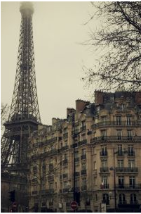
If object-fit: none is used, there is no picture resizing:
Example
					img {
  width: 200px;
  height: 300px;
  object-fit: none;
}
Using object-fit: scale-down;
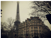
The image is scaled down to the smallest version of none or contains: if object-fit: scale-down is used.
Example
					img {
  width: 200px;
  height: 300px;
  object-fit: scale-down;
}
Another Example
We want these two photos to take up 50% of the browser window’s width and 100% of its height.
Since object-fit is not used in the example below, the aspect ratio of the photos will be lost when the browser window is resized:
Example

The following example makes use of object-fit: cover; to maintain the aspect ratio of the images even when the browser window is resized:
Example

CSS object-fit More Examples
The sample that follows shows every possible value for the object-fit attribute in a single example:
Example
					.fill {object-fit: fill;}
.contain {object-fit: contain;}
.cover {object-fit: cover;}
.scale-down {object-fit: scale-down;}
.none {object-fit: none;}
CSS Object-* Properties
The following table lists the CSS object-* properties:
| Property | Description |
|---|---|
| object-fit | Specifies how an <img> or <video> should be resized to fit its container |
| object-position | Specifies how an <img> or <video> should be positioned with x/y coordinates inside its "own content box" |
