CSS Media Queries Examples
CSS Media Queries - More Examples
Let’s examine a few more instances of media queries in action.
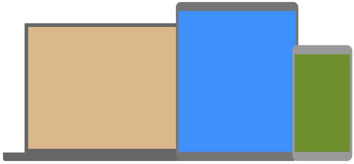
A common method for distributing a customized style sheet to various devices is media queries. To give a basic illustration, we can alter the backdrop color for various devices:

Example
					/* Set the background color of body to tan */
body {
  background-color: tan;
}

/* On screens that are 992px or less, set the background color to blue */
@media screen and (max-width: 992px) {
  body {
    background-color: blue;
  }
}

/* On screens that are 600px or less, set the background color to olive */
@media screen and (max-width: 600px) {
  body {
    background-color: olive;
  }
}
Media Queries For Menus
In this example, a flexible navigation menu with varying designs for different screen sizes is created using media queries.
-------MENU MUKAVA ------
Example
					/* The navbar container */
.topnav {
  overflow: hidden;
  background-color: #333;
}

/* Navbar links */
.topnav a {
  float: left;
  display: block;
  color: white;
  text-align: center;
  padding: 14px 16px;
  text-decoration: none;
}

/* On screens that are 600px wide or less, make the menu links stack on top of each other instead of next to each other */
@media screen and (max-width: 600px) {
  .topnav a {
    float: none;
    width: 100%;
  }
}
Media Queries For Columns
Using media queries to create a flexible layout is a frequent practice. In this example, we design a layout that, based on various screen widths, alternates between four, two, and full-width columns:

Example
					/* Create four equal columns that floats next to each other */
.column {
  float: left;
  width: 25%;
}

/* On screens that are 992px wide or less, go from four columns to two columns */
@media screen and (max-width: 992px) {
  .column {
    width: 50%;
  }
}

/* On screens that are 600px wide or less, make the columns stack on top of each other instead of next to each other */
@media screen and (max-width: 600px) {
  .column {
    width: 100%;
  }
}
Advice: Use CSS Flexbox to create column layouts in a more contemporary manner (see example below). Nevertheless, Internet Explorer 10 and previous versions do not support it. For IE6–10 support, utilize floats (as seen above).
Check out our CSS Flexbox chapter to find out more about the Flexible Box Layout Module.
Read our Responsive Web Design Tutorial to find out more about responsive web design.
Example
					/* Container for flexboxes */
.row {
  display: flex;
  flex-wrap: wrap;
}

/* Create four equal columns */
.column {
  flex: 25%;
  padding: 20px;
}

/* On screens that are 992px wide or less, go from four columns to two columns */
@media screen and (max-width: 992px) {
  .column {
    flex: 50%;
  }
}

/* On screens that are 600px wide or less, make the columns stack on top of each other instead of next to each other */
@media screen and (max-width: 600px) {
  .row {
    flex-direction: column;
  }
}
Hide Elements With Media Queries
Hiding components on various screen sizes is another typical application for media queries:
Example
					/* If the screen size is 600px wide or less, hide the element */
@media screen and (max-width: 600px) {
  div.example {
    display: none;
  }
}
Change Font Size With Media Queries
Media queries can also be used to alter an element’s text size on various screen sizes:

Example
					/* If screen size is more than 600px wide, set the font-size of <div> to 80px */
@media screen and (min-width: 600px) {
  div.example {
    font-size: 80px;
  }
}

/* If screen size is 600px wide, or less, set the font-size of <div> to 30px */
@media screen and (max-width: 600px) {
  div.example {
    font-size: 30px;
  }
}
Flexible Image Gallery
In this example, we combine flexbox and media queries to produce a responsive picture gallery:
Example
---------- Example MUKACU---------
Flexible Website
This example shows how to design a responsive website with a flexible navigation bar and flexible content by using media queries with flexbox.
Example
---------- Example MUKACU---------
Orientation: Portrait / Landscape
Moreover, media queries can be used to modify a page’s layout based on the browser’s orientation.
A “Landscape” orientation refers to a set of CSS characteristics that are only applicable when the browser window is wider than its height.
Example
Use a lightblue background color if the orientation is in landscape mode:
					@media only screen and (orientation: landscape) {
  body {
    background-color: lightblue;
  }
}
Min Width to Max Width
To establish a minimum and maximum width, you can also use the (max-width:..) and (min-width:..) values.
For instance, alter the appearance of a <div> element when the browser’s width falls between 600 and 900 pixels:
Example
					@media screen and (max-width: 900px) and (min-width: 600px) {
  div.example {
    font-size: 50px;
    padding: 50px;
    border: 8px solid black;
    background: yellow;
  }
}
Using an additional value: In the example below, we add an additional media query to our already existing one using a comma:
Example
					/* When the width is between 600px and 900px or above 1100px - change the appearance of <div> */
@media screen and (max-width: 900px) and (min-width: 600px), (min-width: 1100px) {
  div.example {
    font-size: 50px;
    padding: 50px;
    border: 8px solid black;
    background: yellow;
  }
}
