BS4 Cards
Bootstrap 4 Cards
In Bootstrap 4, a card is a box with a border and padding around the contents. It has settings for content, colors, headers, footers, and other things.
Basic Card
The .card class is used to generate a basic card, while the .card-body class is used for content inside the card:
Example
					<div class="card">
  <div class="card-body">Basic card</div>
</div>
Bootstrap 3 users may recognize that cards take the place of previous panels, wells, and thumbnails.
Header and Footer
The card’s header and footer are added using the .card-header and .card-footer classes, respectively:
Example
					<div class="card">
  <div class="card-header">Header</div>
  <div class="card-body">Content</div>
  <div class="card-footer">Footer</div>
</div>
Contextual Cards
Use contextual classes (.bg-primary, .bg-success,.bg-info, .bg-warning, .bg-danger, .bg-secondary, .bg-dark, and.bg-light) to add a background color to the card.
Example
Titles, text, and links
To add card titles to any heading element, use the .card-title suffix. If a <p> element is the only or last child inside .card-body, its bottom margins are removed using the .card-text class. Any link can have a hover effect and a blue color added by using the .card-link class.
Example
					<div class="card">
  <div class="card-body">
    <h4 class="card-title">Card title</h4>
    <p class="card-text">Some example text. Some example text.</p>
    <a href="#" class="card-link">Card link</a>
    <a href="#" class="card-link">Another link</a>
  </div>
</div>
Card Images

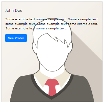
To position an image at the top or bottom inside the card, add .card-img-top or .card-img-bottom to a <img>. Observe that in order to fill the complete width, we have added the image outside of the .card-body:
Example
					<div class="card" style="width:400px">
  <img decoding="async" class="card-img-top" src="data:image/svg+xml,%3Csvg%20xmlns='http://www.w3.org/2000/svg'%20viewBox='0%200%200%200'%3E%3C/svg%3E" alt="Card Image" title="Bs4 Cards 4" data-lazy-src="img_avatar1.png"><noscript><img decoding="async" class="card-img-top" src="img_avatar1.png" alt="Card Image" title="Bs4 Cards 4"></noscript>
  <div class="card-body">
    <h4 class="card-title">John Doe</h4>
    <p class="card-text">Some example text.</p>
    <a href="#" class="btn btn-primary">See Profile</a>
  </div>
</div>
Stretched Link
When a link within the card has the .stretched-link class applied to it, the entire card will become clickable and hoverable (functioning as a link):

Example
<a href="#" class="btn btn-primary stretched-link">See Profile</a>
Card Image Overlays

To add text on top of an image that has been turned into a card background, use the .card-img-overlay function:
Example
					<div class="card" style="width:500px">
  <img decoding="async" class="card-img-top" src="data:image/svg+xml,%3Csvg%20xmlns='http://www.w3.org/2000/svg'%20viewBox='0%200%200%200'%3E%3C/svg%3E" alt="Card Image" title="Bs4 Cards 4" data-lazy-src="img_avatar1.png"><noscript><img decoding="async" class="card-img-top" src="img_avatar1.png" alt="Card Image" title="Bs4 Cards 4"></noscript>
  <div class="card-img-overlay">
    <h4 class="card-title">John Doe</h4>
    <p class="card-text">Some example text.</p>
    <a href="#" class="btn btn-primary">See Profile</a>
  </div>
</div>
Card Columns
Some text inside the first card
Some text inside the second card
Some text inside the third card
Some text inside the fourth card
Some text inside the fifth card
Some text inside the sixth card
A card grid resembling masonry is produced by the .card-columns class (like pinterest). When you add more cards, the arrangement will change automatically.
Note: Vertical card displays occur on small screens (less than 576 pixels):
Example
					<div class="card-columns">
  <div class="card bg-primary">
    <div class="card-body text-center">
      <p class="card-text">Some text inside the first card</p>
    </div>
  </div>
  <div class="card bg-warning">
    <div class="card-body text-center">
      <p class="card-text">Some text inside the second card</p>
    </div>
  </div>
  <div class="card bg-success">
    <div class="card-body text-center">
      <p class="card-text">Some text inside the third card</p>
    </div>
  </div>
  <div class="card bg-danger">
    <div class="card-body text-center">
      <p class="card-text">Some text inside the fourth card</p>
    </div>
  </div>
  <div class="card bg-light">
    <div class="card-body text-center">
      <p class="card-text">Some text inside the fifth card</p>
    </div>
  </div>
  <div class="card bg-info">
    <div class="card-body text-center">
      <p class="card-text">Some text inside the sixth card</p>
    </div>
  </div>
</div>
Card Deck
Some text inside the first card
Some more text to increase the height
Some more text to increase the height
Some more text to increase the height
Some text inside the second card
Some text inside the third card
Some text inside the fourth card
An equal-width and height grid of cards is produced by the .card-deck class. When you add more cards, the arrangement will change automatically.
Note: Vertical card displays occur on small screens (less than 576 pixels):
Example
					<div class="card-deck">
  <div class="card bg-primary">
    <div class="card-body text-center">
      <p class="card-text">Some text inside the first card</p>
    </div>
  </div>
  <div class="card bg-warning">
    <div class="card-body text-center">
      <p class="card-text">Some text inside the second card</p>
    </div>
  </div>
  <div class="card bg-success">
    <div class="card-body text-center">
      <p class="card-text">Some text inside the third card</p>
    </div>
  </div>
  <div class="card bg-danger">
    <div class="card-body text-center">
      <p class="card-text">Some text inside the fourth card</p>
    </div>
  </div>
</div>
Card Group
Some text inside the first card
Some more text to increase the height
Some more text to increase the height
Some more text to increase the height
Some text inside the second card
Some text inside the third card
Some text inside the fourth card
The .card-deck and .card-group classes are comparable. The removal of the left and right margins between each card is the only modification made by the .card-group class.
Note: On little screens (less than 576 pixels), the cards are shown vertically, WITH margins at the top and bottom:
Example
					<div class="card-group">
  <div class="card bg-primary">
    <div class="card-body text-center">
      <p class="card-text">Some text inside the first card</p>
    </div>
  </div>
  <div class="card bg-warning">
    <div class="card-body text-center">
      <p class="card-text">Some text inside the second card</p>
    </div>
  </div>
  <div class="card bg-success">
    <div class="card-body text-center">
      <p class="card-text">Some text inside the third card</p>
    </div>
  </div>
  <div class="card bg-danger">
    <div class="card-body text-center">
      <p class="card-text">Some text inside the fourth card</p>
    </div>
  </div>
</div>
