BS 4 Utilities
Bootstrap 4 Utilities
Many utility/helper classes in Bootstrap 4 allow you to easily customize items without writing any CSS code.
Borders
To add or remove borders from an element, use the border classes:
Example

Example
					<span class="border"></span>
<span class="border border-0"></span>
<span class="border border-top-0"></span>
<span class="border border-right-0"></span>
<span class="border border-bottom-0"></span>
<span class="border border-left-0"></span>
Border Color
Use any of the contextual border color classes to add a color to the border:
Example

Example
					<span class="border border-primary"></span>
<span class="border border-secondary"></span>
<span class="border border-success"></span>
<span class="border border-danger"></span>
<span class="border border-warning"></span>
<span class="border border-info"></span>
<span class="border border-light"></span>
<span class="border border-dark"></span>
<span class="border border-white"></span>
Border Radius
Using the rounded classes, give an element rounded corners:
Example
Example
					<span class="rounded-sm"></span>
<span class="rounded"></span>
<span class="rounded-lg"></span>
<span class="rounded-top"></span>
<span class="rounded-right"></span>
<span class="rounded-bottom"></span>
<span class="rounded-left"></span>
<span class="rounded-circle"></span>
<span class="rounded-0"></span>
Float and Clearfix
Use the .float-right or .float-left classes to float an element to the right or left, then use the .clearfix class to clear floats:
Example
Example
					<div class="clearfix">
  <span class="float-left">Float left</span>
  <span class="float-right">Float right</span>
</div>
Responsive Floats
Use the responsive float classes (.float-*-left|right), where * is sm (>=576px), md (>=768px), lg (>=992px), or xl (>=1200px), to float an element to the left or right based on screen width:
Example
Float none
Example
					<div class="float-sm-right">Float right on small screens or wider</div><br>
<div class="float-md-right">Float right on medium screens or wider</div><br>
<div class="float-lg-right">Float right on large screens or wider</div><br>
<div class="float-xl-right">Float right on extra large screens or wider</div><br>
<div class="float-none">Float none</div>
Center Align
Using the .mx-auto class to center an element adds margin-left and margin-right: auto:
Example
Centered
Example
<div class="mx-auto bg-warning" style="width:150px">Centered</div>
Width
Use the w-* classes (.w-25,.w-50,.w-75,.w-100,.mw-100) to set an element’s width:
Example
Example
					<div class="w-25 bg-warning">Width 25%</div>
<div class="w-50 bg-warning">Width 50%</div>
<div class="w-75 bg-warning">Width 75%</div>
<div class="w-100 bg-warning">Width 100%</div>
<div class="mw-100 bg-warning">Max Width 100%</div>
Height
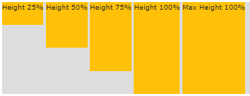
Use the h-* classes (.h-25,.h-50,.h-75,.h-100,.mh-100) to set an element’s height:
Example

Example
					<div style="height:200px;background-color:#ddd">
  <div class="h-25 bg-warning">Height 25%</div>
  <div class="h-50 bg-warning">Height 50%</div>
  <div class="h-75 bg-warning">Height 75%</div>
  <div class="h-100 bg-warning">Height 100%</div>
  <div class="mh-100 bg-warning" style="height:500px">Max Height 100%</div>
</div>
Spacing
- m – sets margin
- p – sets padding
- t – sets margin-top or padding-top
- b – sets margin-bottom or padding-bottom
- l – sets margin-left or padding-left
- r – sets margin-right or padding-right
- x – sets both padding-left and padding-right or margin-left and margin-right
- y – sets both padding-top and padding-bottom or margin-top and margin-bottom
- blank – sets a margin or padding on all 4 sides of the element
Size is one of:
- n1 – sets margin to -.25rem (-4px if font-size is 16px)
- n2 – sets margin to -.5rem (-8px if font-size is 16px)
- n3 – sets margin to -1rem (-16px if font-size is 16px)
- n4 – sets margin to -1.5rem (-24px if font-size is 16px)
- n5 – sets margin to -3rem (-48px if font-size is 16px)
Example
Example
					<div class="pt-4 bg-warning">I only have a top padding (1.5rem = 24px)</div>
<div class="p-5 bg-success">I have a padding on all sides (3rem = 48px)</div>
<div class="m-5 pb-5 bg-info">I have a margin on all sides (3rem = 48px) and a bottom padding (3rem = 48px)</div>
More Spacing Examples
.m-# / m-*-# | margin on all sides | Try it |
.mt-# / mt-*-# | margin top | Try it |
.mb-# / mb-*-# | margin bottom | Try it |
.ml-# / ml-*-# | margin left | Try it |
.mr-# / mr-*-# | margin right | Try it |
.mx-# / mx-*-# | margin left and right | Try it |
.my-# / my-*-# | margin top and bottom | Try it |
.p-# / p-*-# | padding on all sides | Try it |
.pt-# / pt-*-# | padding top | Try it |
.pb-# / pb-*-# | padding bottom | Try it |
.pl-# / pl-*-# | padding left | Try it |
.pr-# / pr-*-# | padding right | Try it |
.py-# / py-*-# | padding top and bottom | Try it |
.px-# / px-*-# | padding left and right | Try it |
Shadows
To apply shadows to an element, use the shadow-classes:
Example
Example
					<div class="shadow-none p-4 mb-4 bg-light">No shadow</div>
<div class="shadow-sm p-4 mb-4 bg-white">Small shadow</div>
<div class="shadow p-4 mb-4 bg-white">Default shadow</div>
<div class="shadow-lg p-4 mb-4 bg-white">Large shadow</div>
Vertical Align
To alter an element’s alignment, use the align-classes (which are limited to inline, inline-block, inline-table, and table cell elements):
Example
baseline top middle bottom text-top text-bottom
Example
					<span class="align-baseline">baseline</span>
<span class="align-top">top</span>
<span class="align-middle">middle</span>
<span class="align-bottom">bottom</span>
<span class="align-text-top">text-top</span>
<span class="align-text-bottom">text-bottom</span>
Responsive Embeds
Make responsive embeds for slideshows or videos according to the parent’s width.
To any embed element (such as <iframe> or <video>), add the .embed-responsive-item in a parent element with .embed-responsive and any desired aspect ratio:
Example
					<!-- 21:9 aspect ratio -->
<div class="embed-responsive embed-responsive-21by9">
  <iframe loading="lazy" class="embed-responsive-item" src="about:blank" data-rocket-lazyload="fitvidscompatible" data-lazy-src="http://..."></iframe><noscript><iframe class="embed-responsive-item" src="..."></iframe></noscript>
</div>

<!-- 16:9 aspect ratio -->
<div class="embed-responsive embed-responsive-16by9">
  <iframe loading="lazy" class="embed-responsive-item" src="about:blank" data-rocket-lazyload="fitvidscompatible" data-lazy-src="http://..."></iframe><noscript><iframe class="embed-responsive-item" src="..."></iframe></noscript>
</div>

<!-- 4:3 aspect ratio -->
<div class="embed-responsive embed-responsive-4by3">
  <iframe loading="lazy" class="embed-responsive-item" src="about:blank" data-rocket-lazyload="fitvidscompatible" data-lazy-src="http://..."></iframe><noscript><iframe class="embed-responsive-item" src="..."></iframe></noscript>
</div>

<!-- 1:1 aspect ratio -->
<div class="embed-responsive embed-responsive-1by1">
  <iframe loading="lazy" class="embed-responsive-item" src="about:blank" data-rocket-lazyload="fitvidscompatible" data-lazy-src="http://..."></iframe><noscript><iframe class="embed-responsive-item" src="..."></iframe></noscript>
</div>
Visibility
To manage an element’s visibility, use the .visible or .invisible classes.
Note: The CSS display value is not altered by these classes. Only visibility:visible and visibility:hidden are added by them.
Example
I am visible
Example
					<div class="visible">I am visible</div>
<div class="invisible">I am invisible</div>
Position
To make any element stay at the top of the page or become fixed, use the .fixed-top class:
==== Example MUKAVU ====
Example
					<nav class="navbar navbar-expand-sm bg-dark navbar-dark fixed-top">
  ...
</nav>
To make any element stay at the bottom of the page or become fixed, use the .fixed-bottom class:
==== Example MUKAVU ====
Example
					<nav class="navbar navbar-expand-sm bg-dark navbar-dark fixed-bottom">
  ...
</nav>
To make any element fixed or stay at the top of the page when you scroll past it, use the .sticky-top class. Note: IE11 and older versions of this class will treat it as position:relative and will not function.
==== Example MUKAVU ====
Example
					<nav class="navbar navbar-expand-sm bg-dark navbar-dark sticky-top">
  ...
</nav>
Close icon
To customize a closing icon, use the .close class. This is frequently applied to modals and alarms. Take note that to make the actual icon (a prettier “x”), we use the × symbol. Remember that it floats right by default as well.
Example
×
Example
<button type="button" class="close">×</button>
Screenreaders
Use the .sr-only class to hide an element on all devices, except screen readers:
Example
<span class="sr-only">I will be hidden on all screens except for screen readers.</span>
Colors
Here is a list of all the text and background color classes, as explained in the Colors chapter:
Text-muted, .text-primary, .text-success, .text-info, .text-warning, .text-danger, .text-secondary, .text-white, .text-dark, .text-body (default body color/often black), and .text-light are the classes for text colors:
Example
This text is muted.
This text is important.
This text indicates success.
This text represents some information.
This text represents a warning.
This text represents danger.
Secondary text.
Dark grey text.
Body text.
Light grey text.
Links can also be used with contextual text classes, which will add a darker hover color:
Example
With the .text-black-50 or .text-white-50 classes, you may additionally apply 50% opacity to black or white text:
Example
Black text with 50% opacity on white background
White text with 50% opacity on black background
Background Colors
.bg-primary,.bg-success ,.bg-info,.bg-warning,.bg-danger,.bg-secondary,.bg-dark, and .bg-light are the classes for background colors.
Keep in mind that background colors do not change the text color, so you may wish to combine them with a .text-* class in some situations.
Example
This text is important.
This text indicates success.
This text represents some information.
This text represents a warning.
This text represents danger.
Secondary background color.
Dark grey background color.
Light grey background color.
Typography/Text Classes
Here is a list of all typography/text classes, as explained in the Typography chapter:
| Class | Description | Example |
|---|---|---|
.display-* | Display headings are used to stand out more than normal headings (larger font-size and lighter font-weight), and there are four classes to choose from: .display-1, .display-2, .display-3, .display-4 | Try it |
.font-weight-bold | Bold text | Try it |
.font-weight-bolder | Bolder bold text | Try it |
.font-weight-normal | Normal text | Try it |
.font-weight-light | Light weight text | Try it |
.font-weight-lighter | Lighter weight text | Try it |
.font-italic | Italic text | Try it |
.lead | Makes a paragraph stand out | Try it |
.small | Indicates smaller text (set to 85% of the size of the parent) | Try it |
.text-break | Prevents long text from breaking layout | Try it |
.text-center | Indicates center-aligned text | Try it |
.text-decoration-none | Removes the underline from a link | Try it |
.text-left | Indicates left-aligned text | Try it |
.text-justify | Indicates justified text | Try it |
.text-monospace | Monospaced text | Try it |
.text-nowrap | Indicates no wrap text | Try it |
.text-lowercase | Indicates lowercased text | Try it |
.text-reset | Resets the color of a text or a link (inherits the color from its parent) | Try it |
.text-right | Indicates right-aligned text | Try it |
.text-uppercase | Indicates uppercased text | Try it |
.text-capitalize | Indicates capitalized text | Try it |
.initialism | Displays the text inside an <abbr> element in a slightly smaller font size | Try it |
.list-unstyled | Removes the default list-style and left margin on list items (works on both <ul> and <ol>). This class only applies to immediate children list items (to remove the default list-style from any nested lists, apply this class to any nested lists as well) | Try it |
.list-inline | Places all list items on a single line (used together with .list-inline-item on each <li> elements) | Try it |
.pre-scrollable | Makes a <pre> element scrollable | Try it |
Block Elements
Add the .d-block class to an element to turn it into a block element. To specify WHEN the element should be a block element on a given screen width, use any of the d-*-block classes:
Example
d-blockd-sm-blockd-md-blockd-lg-blockd-xl-block
Example
					<span class="d-block bg-success">d-block</span>
<span class="d-sm-block bg-success">d-sm-block</span>
<span class="d-md-block bg-success">d-md-block</span>
<span class="d-lg-block bg-success">d-lg-block</span>
<span class="d-xl-block bg-success">d-xl-block</span>
Other Display Classes
There are further available display classes:
| Class | Description | Example |
|---|---|---|
.d-none | Hides an element | Try it |
.d-*-none | Hides an element on a specific screen size | Try it |
.d-inline | Makes an element inline | Try it |
.d-*-inline | Makes an element inline on a specific screen size | Try it |
.d-inline-block | Makes an element inline block | Try it |
.d-*-inline-block | Makes an element inline block on a specific screen size | Try it |
.d-table | Makes an element display as a table | Try it |
.d-*-table | Makes an element display as a table on a specific screen size | Try it |
.d-table-cell | Makes an element display as a table cell | Try it |
.d-*-table-cell | Makes an element display as a table cell on a specific screen size | Try it |
.d-table-row | Makes an element display as a table row | Try it |
.d-*-table-row | Makes an element display as a table row on a specific screen size | Try it |
.d-flex | Creates a flexbox container and transforms direct children into flex items | Try it |
.d-*-flex | Creates a flexbox container on a specific screen size | Try it |
.d-inline-flex | Creates an inline flexbox container | Try it |
.d-*-inline-flex | Creates an inline flexbox container on a specific screen size | Try it |
Flex
To control the layout with Flexbox, use the .flex-* classes.
See our upcoming chapter for additional information about Bootstrap 4 Flex.
Example
Horizontal:
Vertical:
