Column Charts
Column Charts
The data is displayed as vertical bars in column charts.
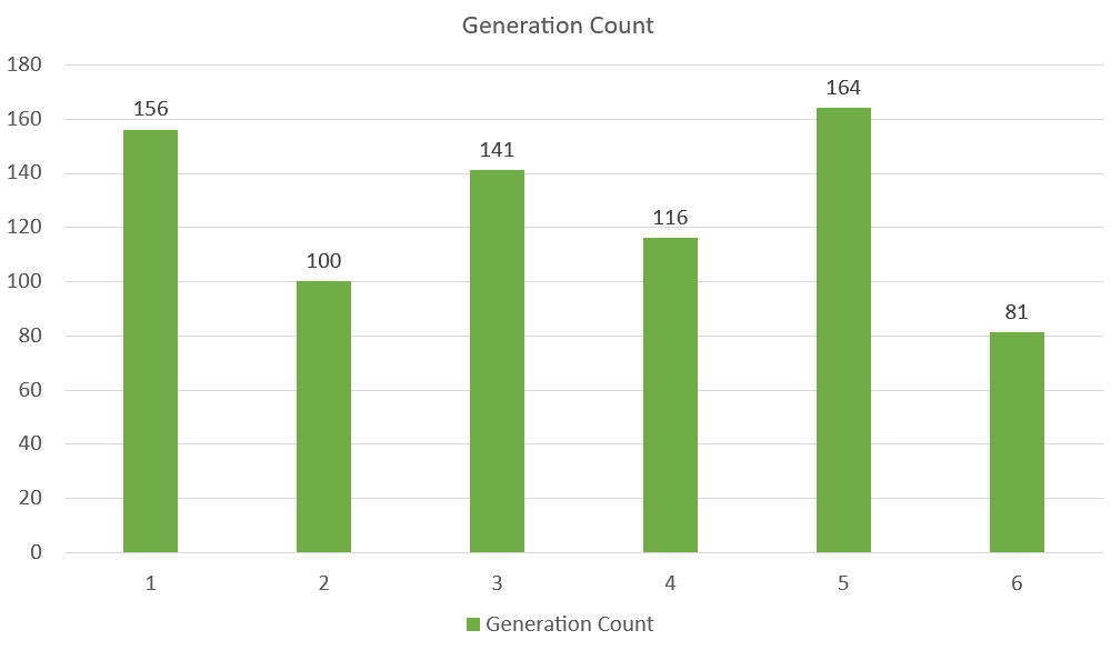
Qualitative (categorical) data values are best represented by column charts.
Note: Statistics Data Types has additional qualitative (categorical) data that you can peruse.
Three distinct kinds of column charts are available in Excel:
- Clustered column(
)
- Stacked column(
)
- 100% Stacked column(
)
Clustered Column Chart
When data value matters more than order, clustered column charts are utilized.
Example With One Data Column
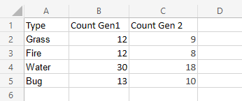
We want to find the number of generation 1 Pokemons with types “Grass”, “Fire”, “Water” and “Bug”.
You can copy the values to follow along:
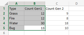
- Select the range A1:B5
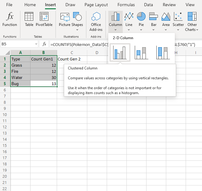
2. Select Clustered Column () from the drop-down menu after selecting the Insert menu and then the Column menu (
).
Note: To access this menu, expand the ribbon.
Well Done! You will obtain the chart below by following the aforementioned procedures.
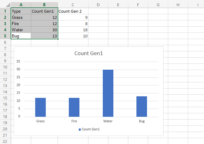
The graphic provides a summary of the generation 1 “Grass,” “Fire,” “Water,” and “Bug” type Pokemon.
Among all Pokemon in the first generation, type “Water” has the most.
Example With Two Data Columns
Now let’s do the same for generation 2 Pokemons and compare the results with the last example.
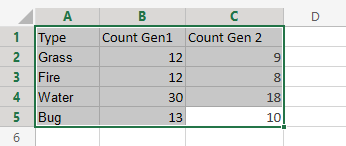
- Select the range A1:C5
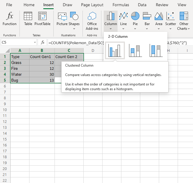
2. Select Clustered Column () from the drop-down menu after selecting the Insert menu and then the Column menu (
).
Note: To access this menu, expand the ribbon.
You should get the chart below:
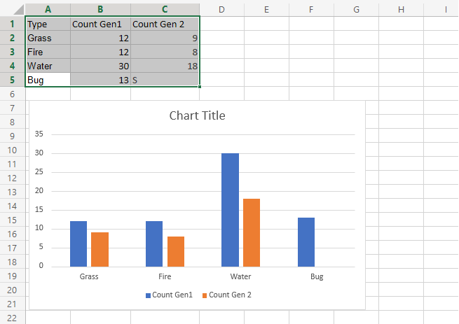
The “Grass,” “Fire,” “Water,” and “Bug” type Pokemon from generations 1 and 2 are visually summarized in the graphic.
Generation 2 is displayed in orange, and Generation 1 is displayed in blue.
In both generations, the type “Water” has the most Pokemons.
Additionally, generation 1 has more Pokemon than generation 2.
